An AREA TO GIVE 120%
I worked closely with A120 throughout the project, from pitch to final delivery. My responsibilities included refreshing the brand, UX / interaction design, setting the photography direction, editing photos, motion and the final web design deliverable for both desktop and mobile. We designed it for longevity, and as of July 2018, only portions of the homepage are released so unfortunately I can only share general information.

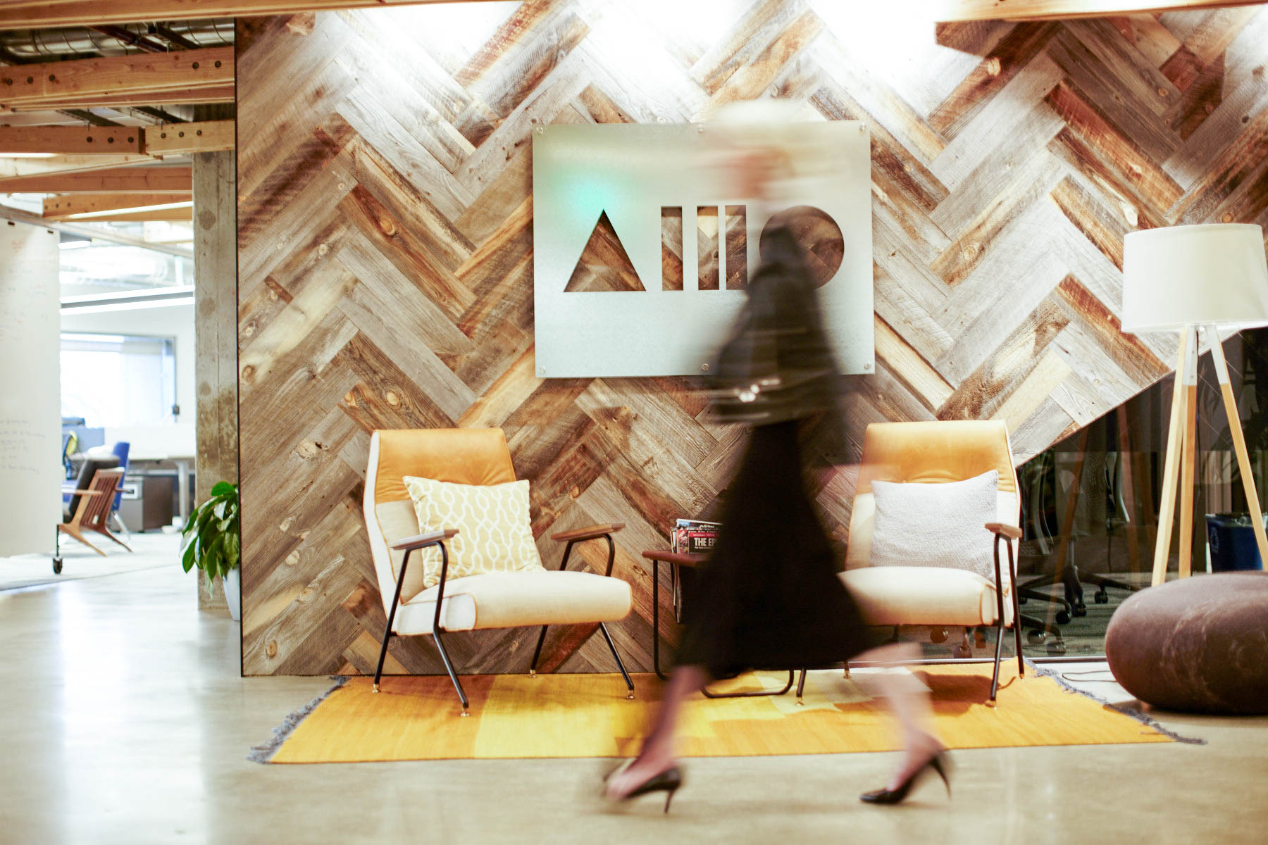
My input going into this project was a single jpeg logo. No source file, just the image of the original shapes created in pre Google re-brand colors. There was color updating and optical spacing to tweak, but I strove to be the least obtrusive to respect the original intentions of the brand. Having a clean vectorized logo at hand proved to be handy for later masking experiments in the browser.
Our process, in essence, was fairly typical. Personas, IA, Wireframes, UI and Visual. However, simultaneously I was extracting a brand from personal accounts from the core team which we started early as it often takes months. An unusual process deviation I had to commit to early on in this process was to demarcate space for the feeling of discovery and surprise for our users. It was a common theme that had come up several times in conversations with the client.

As you'll see in early styleframes, this allocation allowed to us to make motion and the brand's bold shapes to take the forefront of the experience. The brand's motion style we developed was inspired by Rube Goldberg machines, which are often built out through exploratory, collaborative competitions in engineering programs, a fitting spirit for an analogy for the workshop.